Themes
Themes are used to customize component styles to fit the specific aesthetic of a brand or product.
Theming basics
Themes are used to modify existing components to fit a specific visual style. By using Carbon’s tokens, developers can easily customize all of their components by changing a set of universal variables, eliminating the need to modify individual components.
Theme terms
| Term | Definition | |
|---|---|---|
| Theme | A collection of visual attributes assigned to the tokens in order to create a specific aesthetic | |
| Token | A role-based identifier that assigns a value to a theme. Tokens are universal and never change across themes | |
| Role | The systematic usage(s) of a token. Roles cannot be changed between themes | |
| Value | The actual style (such as a hex code) assigned to a token |
Default theme
Carbon provides four themes as shown in the color usage page. When
@carbon/react
To use the Gray 10, Gray 90, or Gray 100 theme as your default instead of White, configure the sass module using
with
@use '@carbon/react/scss/themes';@use '@carbon/react/scss/theme' with ($theme: themes.$g100);
Customizing a theme
The default theme acts as a starting point; from there designers and developers can define how their own components and styles deviate from the default. Altering one, some, or all of the default token values will result in a new theme. The developer configures these new values by configuring the sass module using
with
@use '@carbon/react/scss/theme' with ($theme: (background: #e2e2e2,text-primary: #ffffff,custom-token-01: #000000,));
Tokens
With tokens, the code only needs to be changed in one place to see the effect system-wide. Tokens are used across all components and help keep global patterns and styles consistent.
All tokens come pre-baked into the Carbon component source code. Tokens are denoted by the prefix
$
$layer-01
$interactive
$blue-60
There are several token categories:
- Color
- Spacing
- Typography
- Global
The full list of tokens available can be found in the source of the
@carbon/themes
Color
Each theme is assigned universal color variables, which are determined by common roles and usage. This allows for uniform color application across themes while maintaining full styling flexibility. For more information, see the color page.
Spacing
Use the spacing scale when building individual components. It includes small increments needed to create appropriate spatial relationships for detail-level designs. For more information, see the spacing page.
Typography
Typography has four categories of type styles (universal, productive, editorial, and additional) that can be customized through tokens. These tokens are used both within components and across layouts. Type tokens are determined by their role across the system. For more information, see the typography page.
Global
The other categories are global and component-specific variables. These control
more general styling of components, such as layer usage or border width. The
full list of tokens available can be found in
the source of the
Theming applied
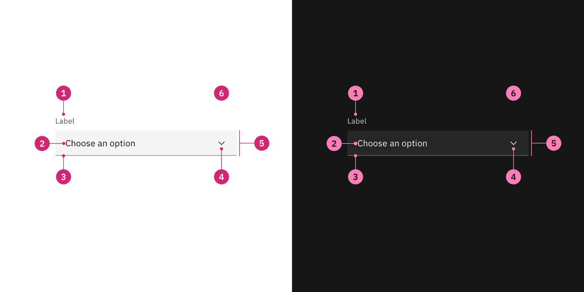
The following example demonstrates the relationship between the different themes. Each theme shares the same variables and roles, with only the value changing for each individual theme.

| Key | Token | Role | White theme value | Gray 100 theme value |
|---|---|---|---|---|
| 1 |
| Label color | Gray 70 | Gray 30 |
| 2 |
| Primary text color | Gray 100 | Gray 10 |
| 3 |
| Border bottom color | Gray 50 | Gray 60 |
| 4 |
| Primary icon color | Gray 100 | Gray 10 |
| 5 |
| Field color | Gray 10 | Gray 90 |
| 6 |
| Page background | White | Gray 100 |