Carbon for AI
Carbon for AI is an extension of the Carbon system, designed to give AI instances in IBM products a visually and behaviorally distinct identity.
Introduction
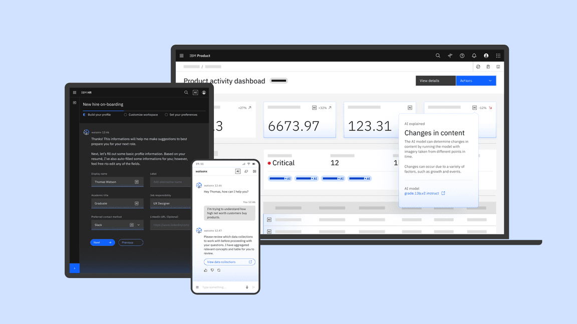
AI introduces a range of new responsibilities when designing experiences across our software, particularly regarding trust and transparency. Carbon for AI is the framework for identifying AI-generated content and delivering explainability in our products.
Use the AI label and styling to mark any instances of AI usage
Transparency of AI presence is key to user trust. Having a consistent identity helps build awareness and anticipation of AI presence across our experiences.
Provide transparency of AI at each level of the experience
Whether AI exists within a single word or across the entire page, users should clearly understand how pervasive an AI is implemented.
Integrate explainability into the overall user workflow and experience
This integration requires you to minimize distractions and show explanations only when needed or requested by the user.
Don’t use the Carbon for AI styling as decoration
While these new styling elements are enticing, they are strictly intended to identify any instances of AI being used in an experience.
What Carbon for AI provides
- A set of guidelines and considerations for incorporating AI into products
- Visual guidance and style elements to represent AI’s presence
- A set of reusable core components with the AI styling already applied
- New custom AI components used for AI transparency and explainability
Assets
| AI Asset | Status | Figma library | Code |
|---|---|---|---|
| AI style elements | Experimental | (v11) All themes | @carbon/themes |
| AI Carbon components | Experimental | (v11) All themes | React, Web-components |
| AI chat | Experimental | Chat component library | watsonx Assistant, @carbon-labs/ai-chat |
Style elements
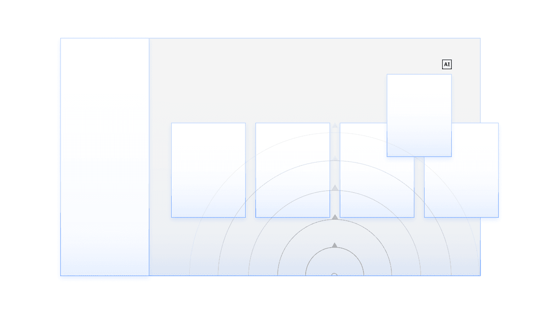
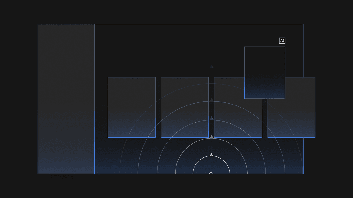
Carbon for AI styling builds on the core Carbon library principles, using light as a metaphor to “illuminate” AI-generated content. This makes AI-generated or AI-recommended content distinctive and stands out for users. For IBMers only: To learn more about the Carbon for AI styling, see Design for AI: Style elements.
Designed to illuminate AI to the users
Carbon for AI uses light-inspired effects like brightness, glow, and gradients to emphasize AI instances across the experience.
An extension of the IBM Design Language
Carbon for AI is designed to coexist alongside the Carbon themes but has its own unique visual characteristics that distinguishes it as AI while following the IBM Design Language DNA and principles.
New color and style tokens for creating your AI experiences
To accommodate for these AI styles, we are introducing a new suite of color and style tokens that can be found within the main Carbon themes. Using the AI tokens does not require a different theme or elements package. When building custom AI component variants or instances in your UI use these new color tokens to stay consistent with the AI styling. For a full list of the new tokens, go to color tokens.
AI explainability
Explainability is a set of processes and methods that make AI decisions more comprehensible to humans. For IBMers only: To learn more about explainability, see Design for AI: Explainability.
Well-designed explainability:
- Builds trust with users
- Improves understanding of an AI system
- Increases usage and interaction
- Enables product teams to gain further insights to improve the AI system
Use the AI label as the path to explainability
The AI label is the primary indicator to communicate that AI is present, and it’s how users can access explainability content.
Start with summarized explanations
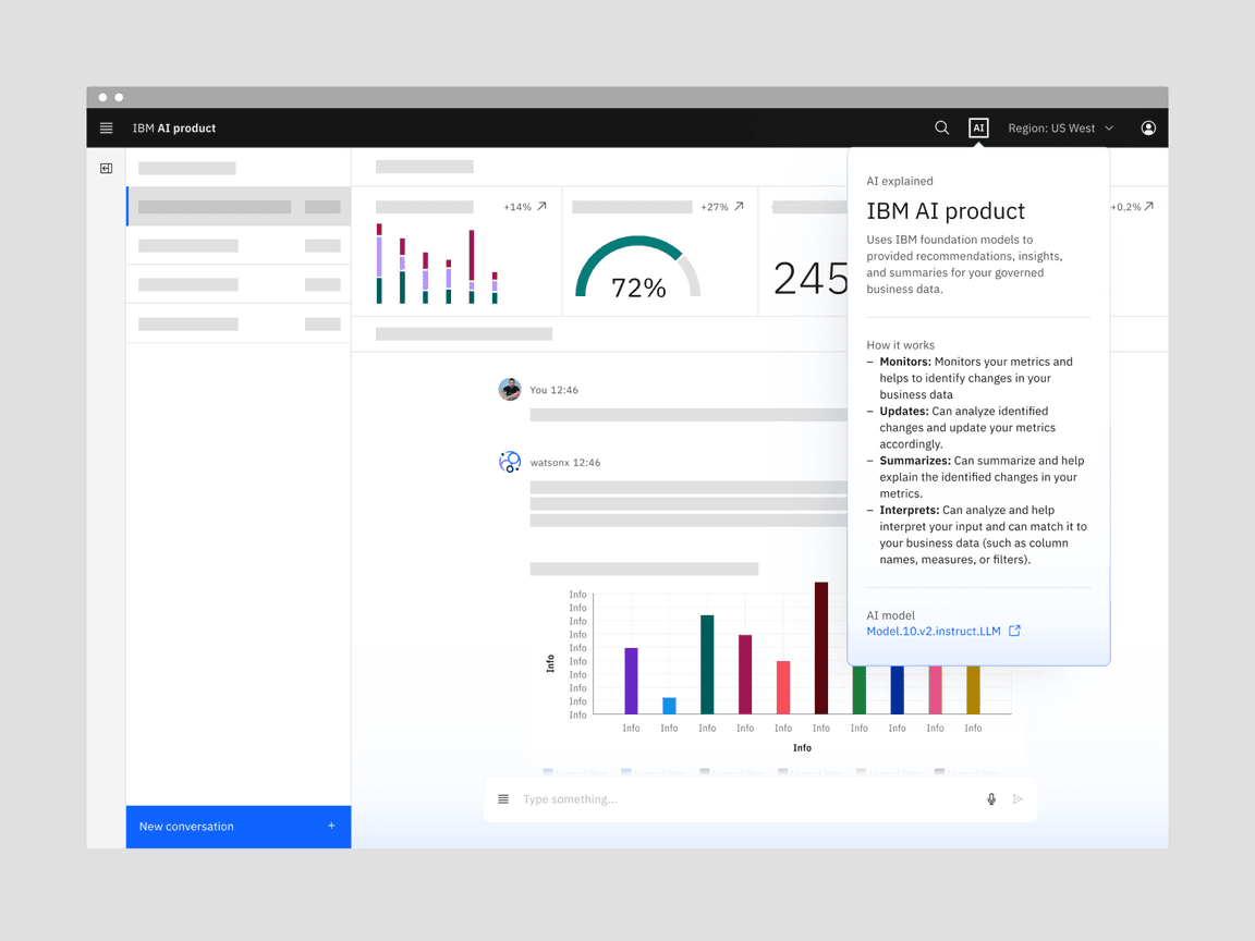
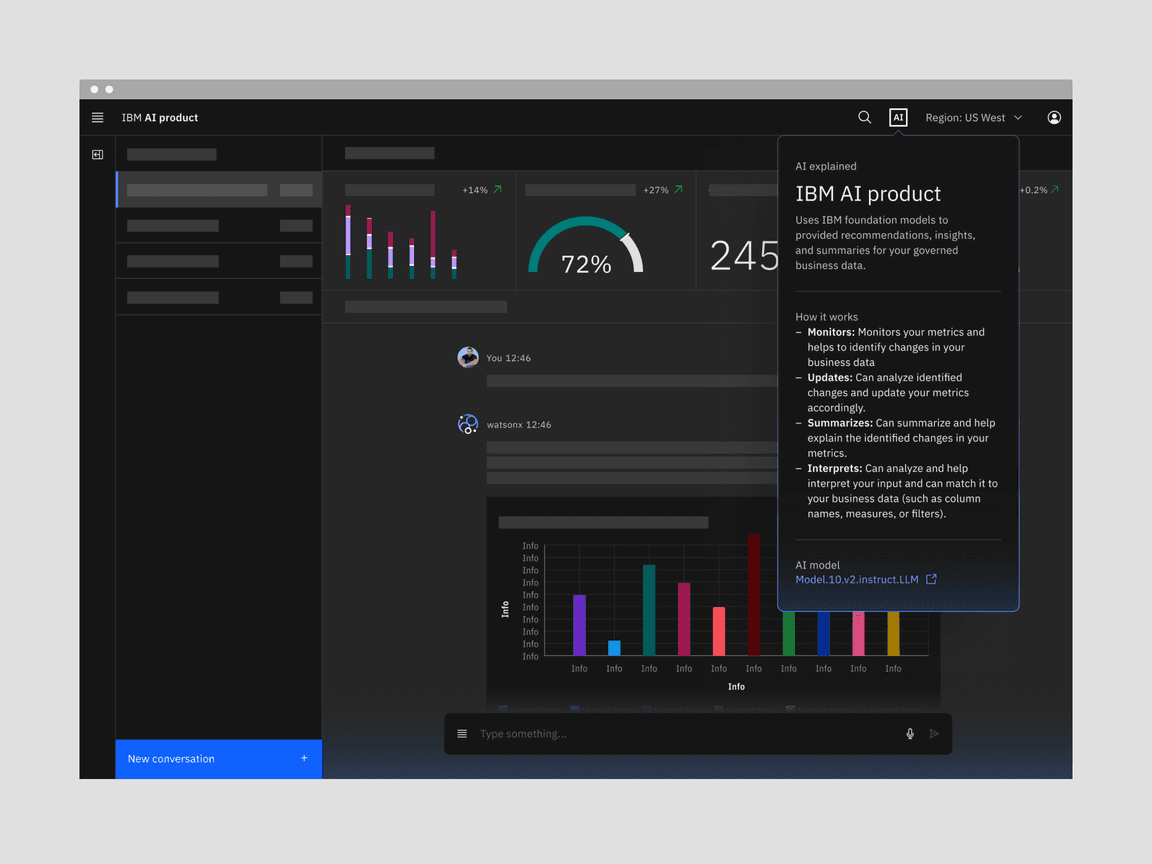
As a first layer of explainability, use the explainability pop-over attached to the AI label to provide a quick, in-context option to explain AI results for a particular instance.
Explainability resources
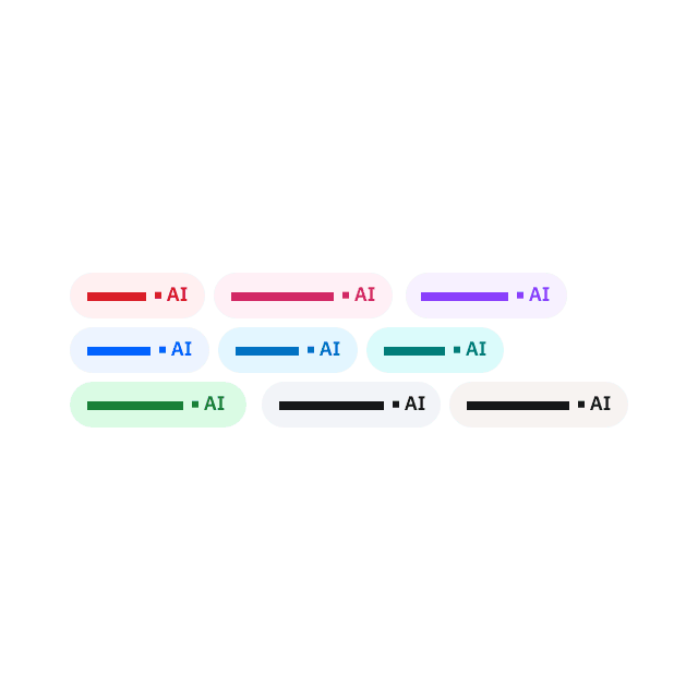
AI label
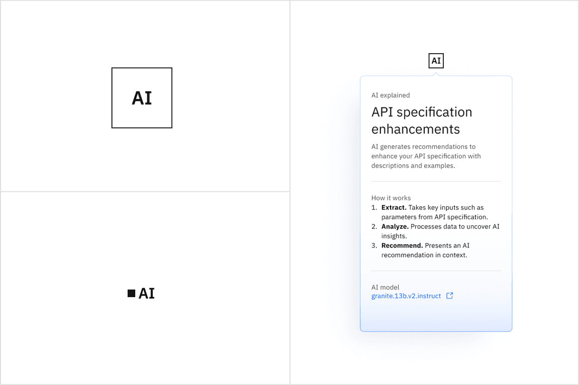
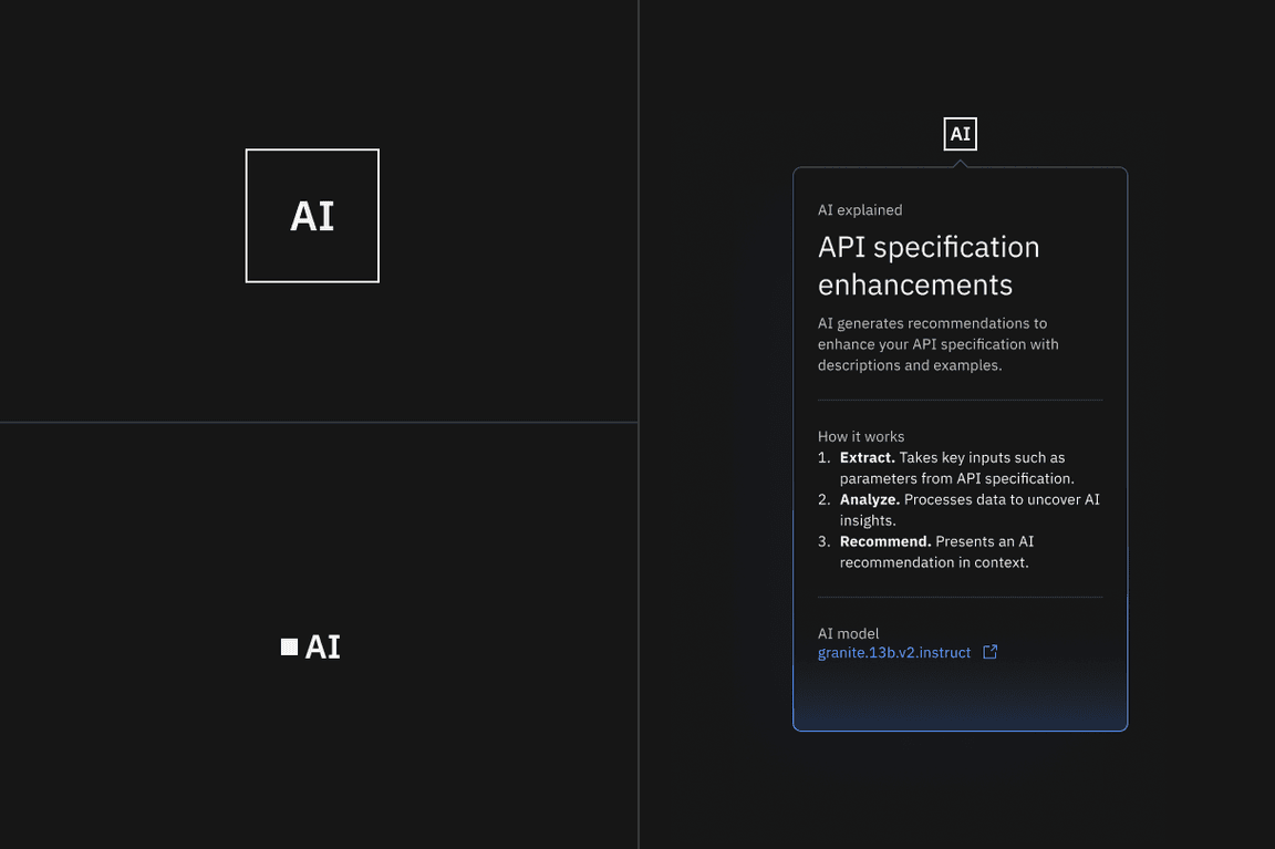
The AI label is a component used as an indicator of AI instances in the UI. It is intended for any scenario where AI is generating content to reinforce AI transparency, accountability, and explainability at any interface level. It enables more effective recognition and recall of AI instances in a way that is identifiable across any IBM product.
The AI label is also the trigger for the explainability popover which serves as the first layer of explainability. It provides a consistent, up-front way to access explainability with the option to dig into more details if needed.
When to use the AI label
Mark AI-generated content with an AI label
AI transparency is key, and the AI label is an accessible, interactive element that can mark these instances as presented in the interface. The label has been designed to work in many instances where AI-generated content can be surfaced as in components, see the component section for more details.
Use the AI label to provide a consistent visual reference point for AI
For recognition and recall, users need a consistent, identifiable visual reference to look to when they need to understand more details about how the AI was built.
Use the AI label as a pathway to explainability
Users must clearly understand how to access more details about how an AI was built. By providing a bridge to explainability from the AI label, users are given a recognizable location to learn more about the AI model.
For more information about using the AI label, see the AI label component page.
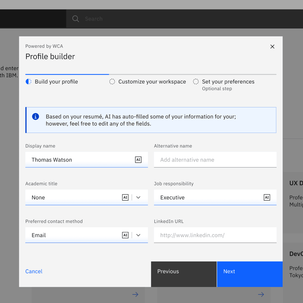
AI chat
AI chat is a conversational framework between a user and an AI that can aid in creating tasks, finding insights, tracking documents, and more. For IBMers only: To learn more about chat, see Design for AI: Chat pattern.
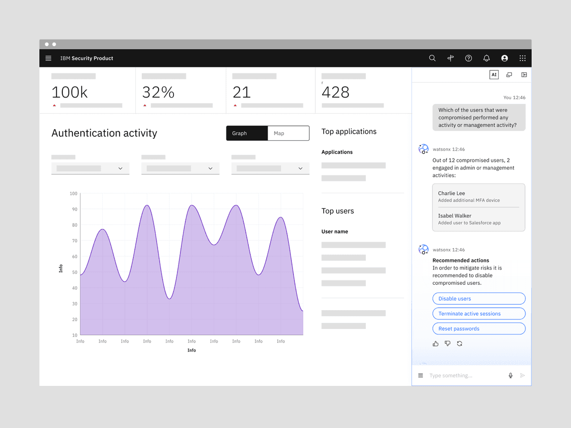
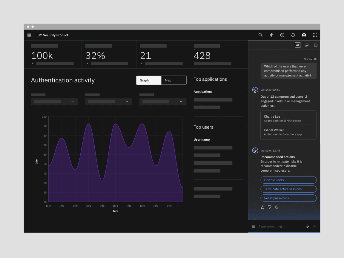
Chat resources
For IBMers only: The chat component Figma library includes design assets, components, and generals chat usage guidelines.
AI components
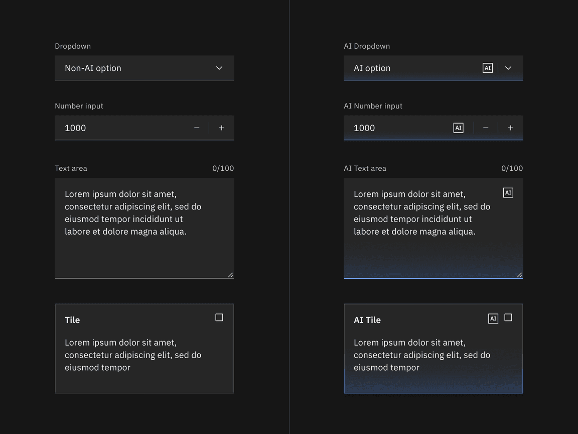
Carbon components with an AI presence are styled using Carbon for AI. Each AI component is required to have an embedded AI label and explainability popover that alerts users to AI-generated content. When the AI label is turned on, the component transforms to the AI visual style but still functions like the standard one.
Start designing
The AI presence styling for core Carbon components is available in the “(v11) All themes” Figma library. To use it, simply grab the normal component asset, and then in the layers panel, go to “Change variable modes” and choose “AI presence,” followed by “All AI elements.”
Start developing
Components in Carbon come with the AI style properties already available for use through a mix-in. For more details on how to use the AI label in code, see the React and Web-components storybooks.
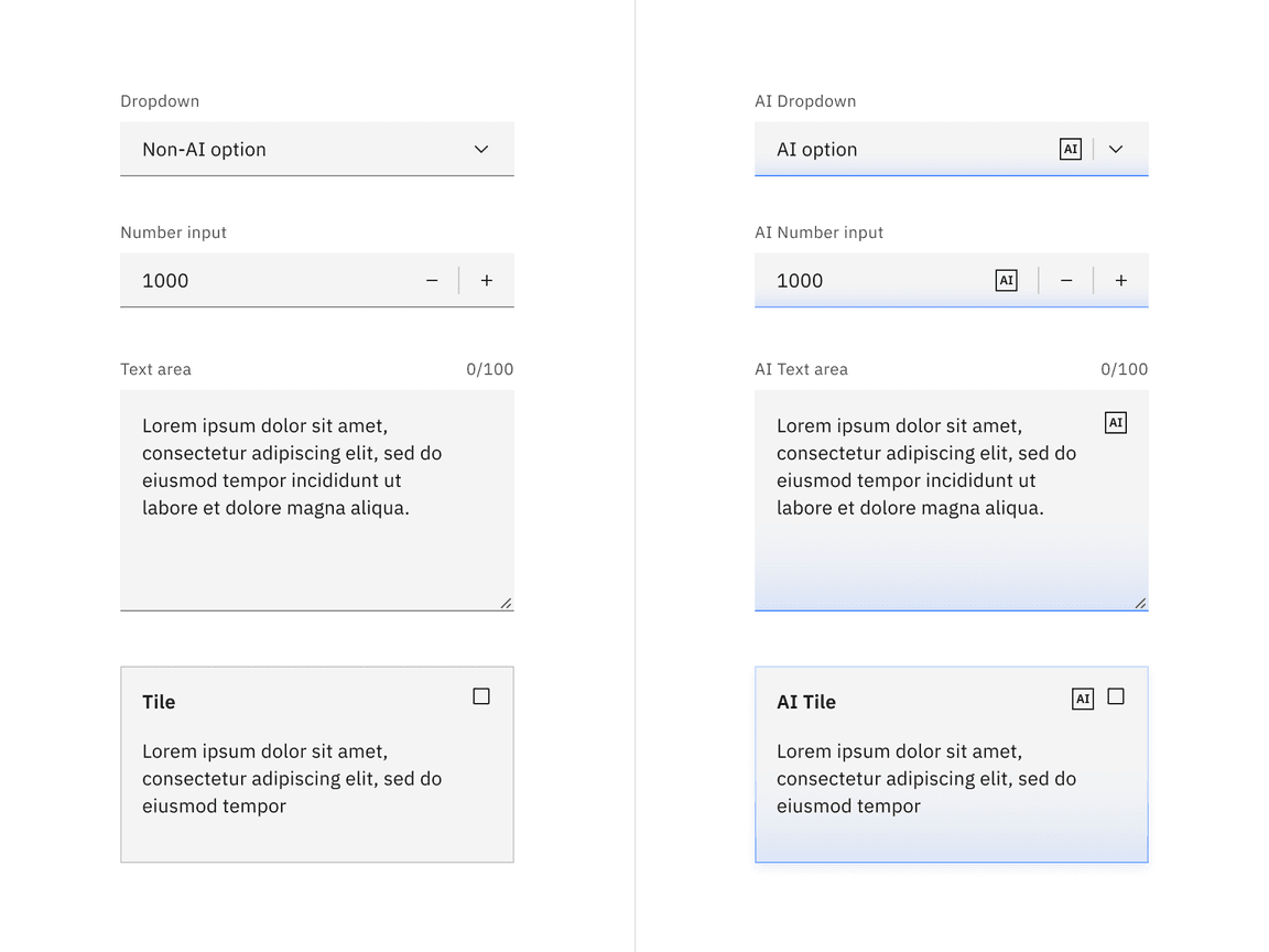
Revert functionality
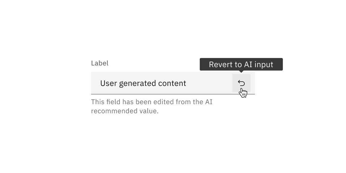
These components can toggle between the AI variant and the default variant depending on the user’s interaction. If the user manually overrides the AI-suggested content then the component will change from the AI variant to the default variant. Once edited, the user should still be able to switch back to the initially AI-generated content via a revert to AI button.
Component list
The following list of components are the core components that have an available AI variant. All of the AI components in Carbon have been designed to work harmoniously together, as parts of a greater whole.
Accessibility
When designing an AI experience, ask if the user knows AI is being used. The base principle of Carbon for AI is to mark where AI is present while providing explainability whenever available. This level of transparency helps build trust between users and the system. This transparency is crucial as the line between AI and human is becoming increasingly blurred.
Tested for color contrast
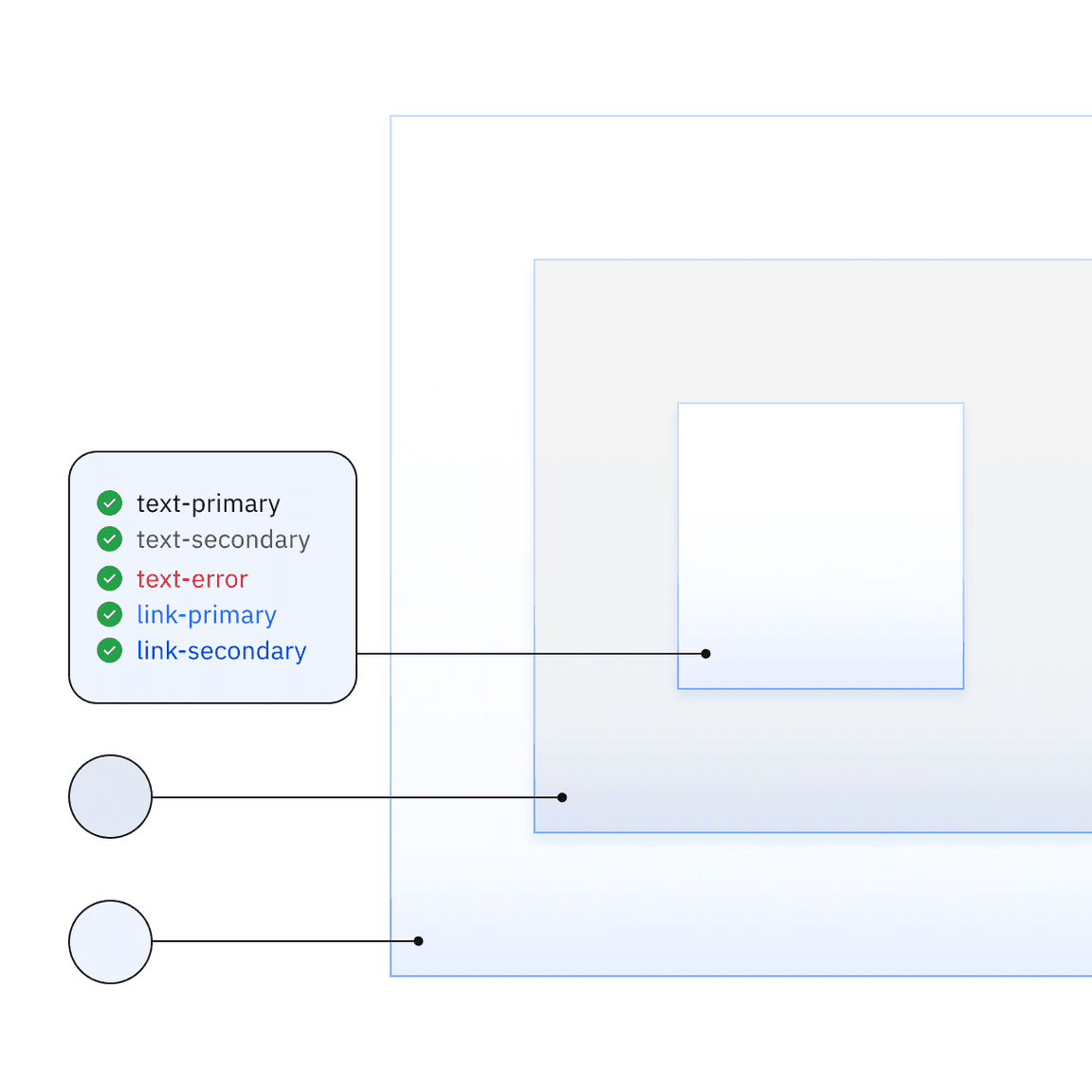
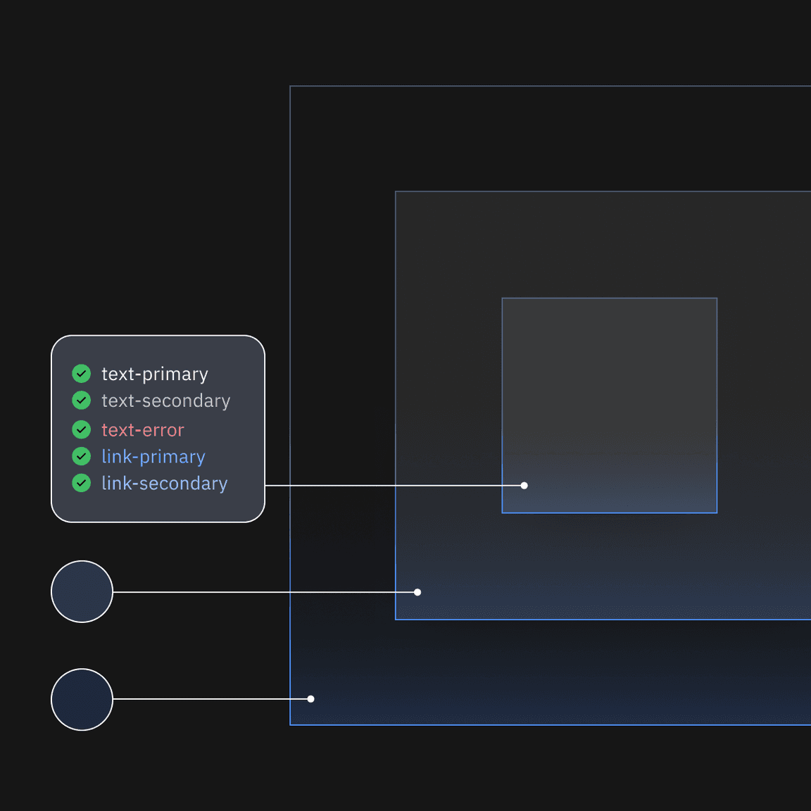
The Carbon for AI style elements and components are tested for accessibility to ensure that colors, type, and contrast adhere to Carbon’s existing accessibility standards.
AI label provides accessible AI visibility
The AI label is the primary indicator to communicate that AI is present. To ensure that the AI label remains accessible across light and dark themes, use the provided component.
Light spread is limited for readability
Carbon for AI utilizes light sources to distinguish it from base Carbon components. These light sources glow on container edges, but the spread is limited and subtle to ensure accessible contrast with UI content.
AI resources
Feedback
Help us improve this component by providing feedback, asking questions, and leaving any other comments on GitHub. For IBMers only: Questions and feedback can be directed to Slack in the channels #carbon-design-system or #carbon-for-ai.


